Product • UX • UI • Visual • Branding • Copy • HTML • CSSOneWed became the 5th most visited wedding website online after our redesign.
When we inherited OneWed, it was immediately clear that we'd have to do more than just rebrand it. We had to completely reorganize and reimagine the site while maintaining the elements that were already bringing in traffic and money (a compromise I believe was ultimately damning).
The challenge was that we had a vendor directory that was active and bringing in money, a huge directory of wedding products (a data goldmine in the wedding world), and killer SEO based largely on our editorial. To remove any one of those components in order to simplify the product would be like chopping a limb off and was considered too risky.
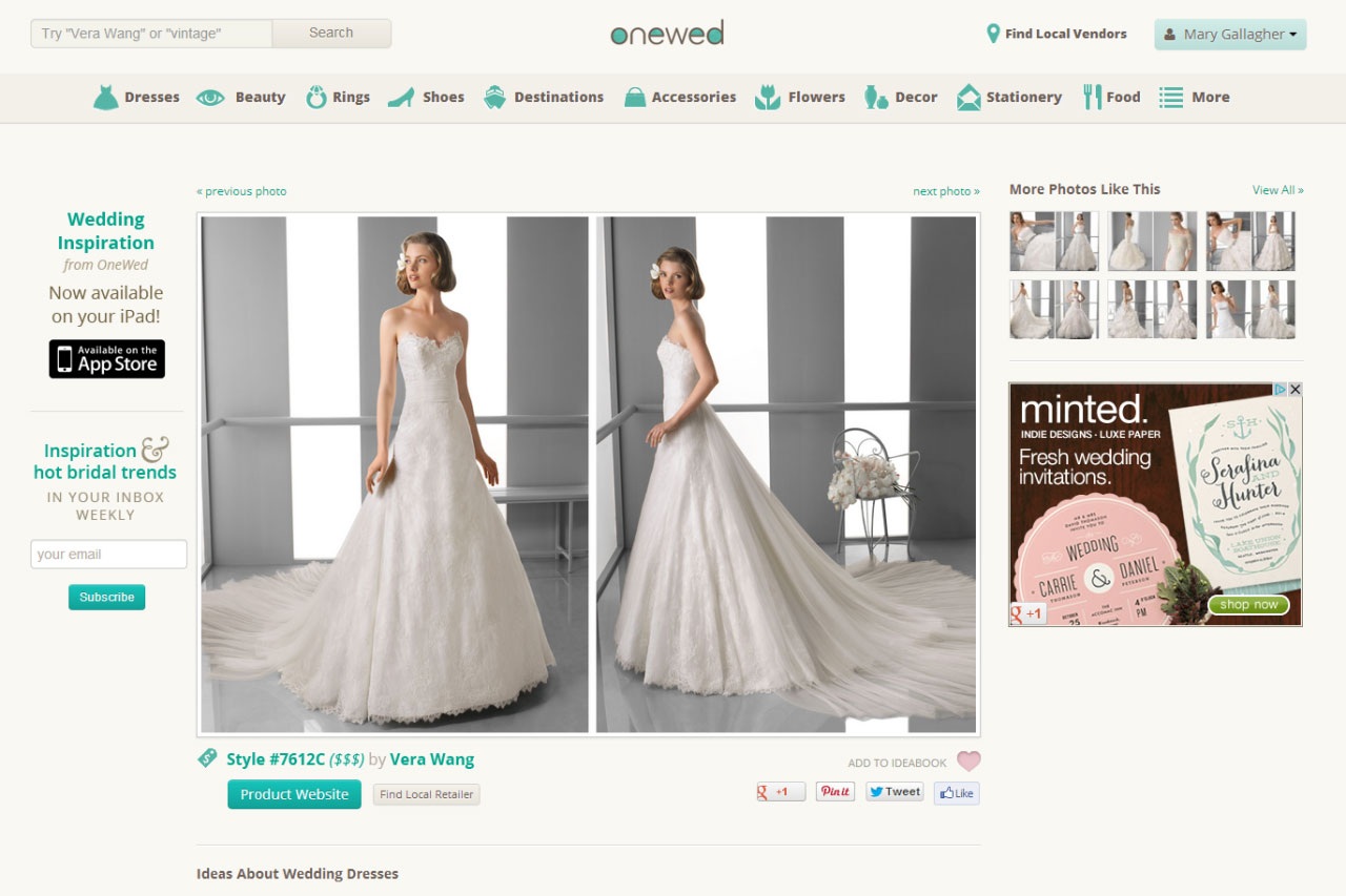
The redesign transformed OneWed from a disorganized SEO trap into the 5th most visited wedding website online. Getting to this solution was largely a matter of rewriting the information architecture — analyzing the available elements of the site and creating a set of semantics from them. The common theme was beautiful photos, so we turned the site into essentially Pinterest for weddings. The major difference being that each photo was actionable inspiration — each image linked to either a product, a local vendor, or an editorial piece.
In the end, we increased traffic but struggled to convert visitors and eventually ran out of money. It's an unfortunate truth that design can't cover up an overly complicated product, and products with a highly focused purpose are far more likely to succeed. Simplify!
The challenge when we got to it…
And some of the early inventory we had to do to start reorganizing the IA.


